Hanson: Journey of an international student
Check out the video case study for Hanson Education
Problem
To get new students to apply online to Hanson without an agent by enhancing the website’s functionality while figuring out how to give them a sense of belonging and community
Goals
To bring a sense of community and trust to Hanson brand
Site reflects the lifestyle and learning outcome for students
Creating a simple navigation system for students to apply online
Clear separation between the Hanson education main umbrella, collage, high school and ESL schools, with a main focus on the college site
Solution
Through our research and planning we were able to bring a very user friendly and simple to navigate website for future potential international students. By bringing in a sense of community to the site, we helped create a welcoming website. Enhancing and adding new pages such as events, job boards, and informative program pages gave the user a good sense of Hansons culture and values. As the company was going through a rebranding process, we were able to create a new look and feel that brought consistency and ease of use.
Project overview
Time
3 week sprint
Team
3 UX Designers
1 UI Designer
Role
UX Designer
User Researcher
User Tester
Programs Used
Figma
Miro
Adobe InDesign
Google Forms
What is Hanson all about?
Hanson is a private international school, that teaches secondary, post-secondary, and language programs to both domestic and international students in Toronto and BC. Hanson prepares students to further their education and /or jump into the workforce and start a career. Finding new ways to encourage new students to come to Hanson.
Meeting the client
We first met with our client, the marketing team at Hanson. We were briefed on who Hanson is, what they do, what they hope to achieve, as well as the problems that they are currently facing. They were going through a full rebranding process and making sure the 3 divisions of schools (college, high school and ESL) were clearer. The college was also the main money driver so they wanted us to focus on the college site.

Surveys • Affinity Diagram • Comparative and Competitive Analysis
Surveys and interviews
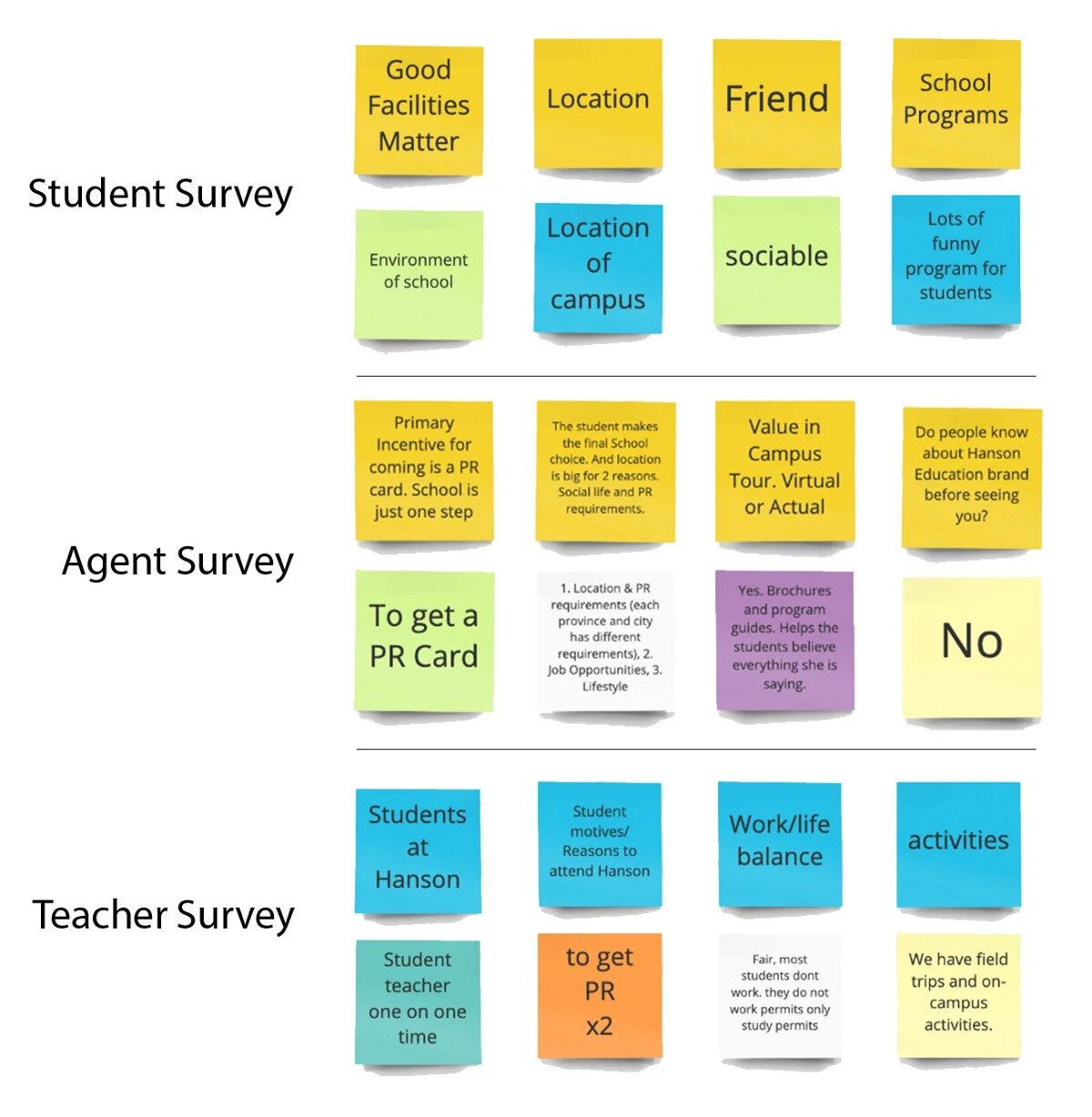
Surveyed and interviewed: 61 student, 4 agent and 7 teacher
Primary Users: Students
Secondary Users: Agents and teachers
Key takeaways from student surveys
Majority of our students were from India, ranging from the age of 18–24
72% of current students said they would benefit from and take advantage of an alumni program
45% of Students said programming was a big influencer for why they chose Hanson
Key takeaways from the teachers and agent surveys
Location and lifestyle important for students
Website was hard to navigate for new students
Most students a primary purpose for going to school abroad is to get permanent residency
C&C analysis
Comparing direct and indirect competitor websites. Some missing features from Hanson’s website included:
Testimonials
Virtual Tours
Events
Social Media Links
Hanson was very informative but difficult to navigate. To us, this meant that we had to simplify and make the Hanson site more clear for users to navigate.

Persona • Journey map
Creating a persona
Afsha Sigh
Her frustrations:
Unable to choose which school to go to because she is having a hard time finding what student life is like for an international student via websites.
Needs familiarity in the community from India to ease the culture shock
Her goals:
Wants to use her education to attain permanent residency
Wants to learn at a school that has a familiar community to ease into Canadian life
Her motivations:
Looking to build a new life in Canada and hopes to become a Canadian resident
Wants to learn everything there is to being Canadian
User journey map
As seen from the journey map, Afsha struggles to find the right school for her needs. She becomes frustrated but this is where we see the opportunities to help her out.
Her opportunities:
Promoting Hanson Education in international countries as an option through social media and Search engine optimization.
Visuals on website such as videos will inform and give an overall experience of Hanson Campus
Clubs and events to show college engagement
Key takeaways from the research and planning
Simple navigation
Clear program outlines
Events and student life
What Hanson has to offer
Informative yet precise
Alumni page enhancements
Quick and easy way to apply

Site map • Lo-fi - wireframes • User flow • Mid-fi - prototype • User testing • UI • Hi-fi
Site map
Creating a site map helped us to simplify and separate sections and headings into their correct spots.
Lo-fi
When creating our lo-fi’s, we were stuck on how to separate the different sectors of schools without just making one landing page that only directs to one of the other school sector sites. The solution was to make two nav bars that would have all the different school sector logos that the user could toggle through.
User flow
We chose to take the student through an application process.
Mid-fi
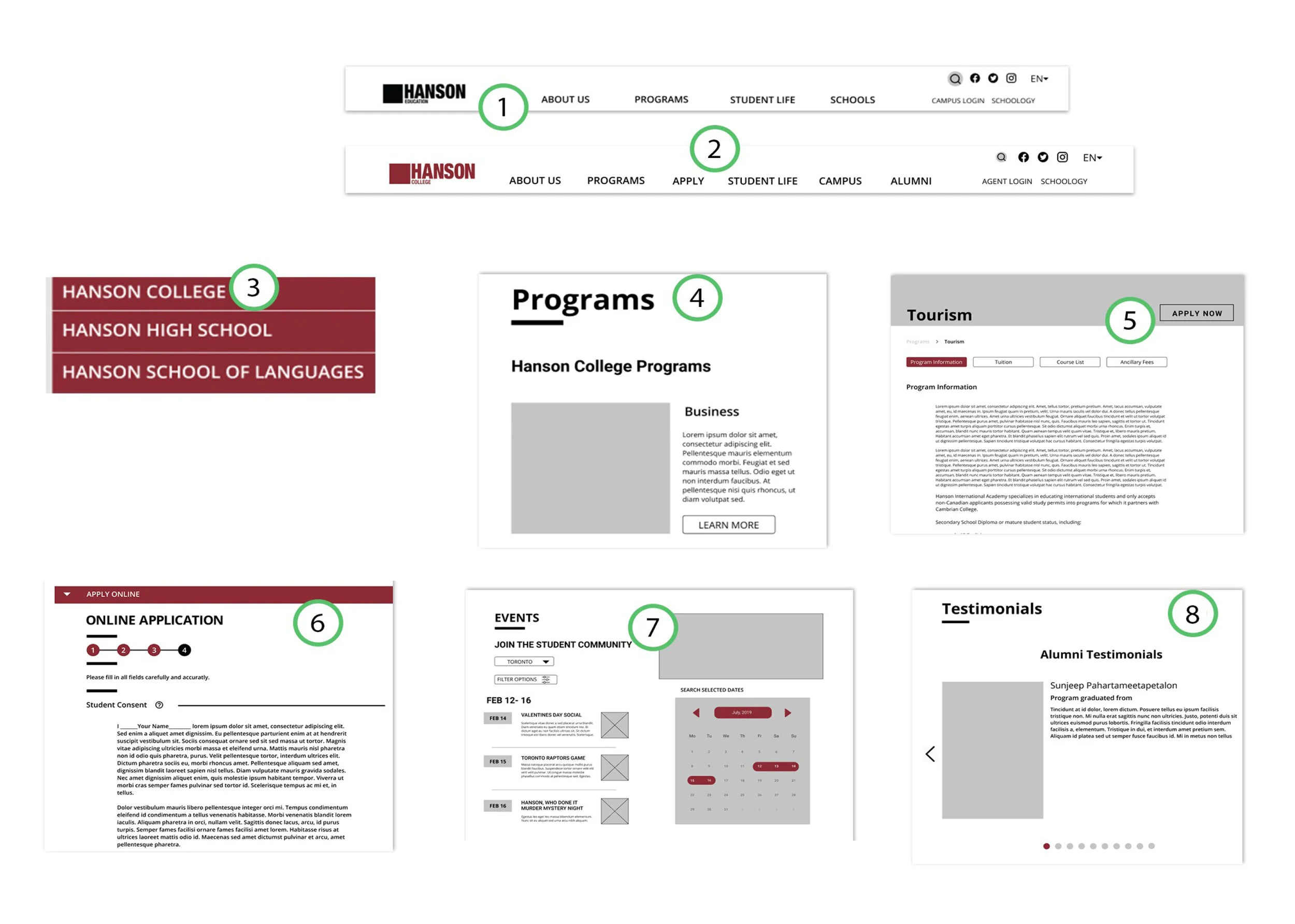
1 - The Hanson Education page had its own unique nav bar to separate it from the other sites.
2 -Hanson College site navbar was also used on other school sites. Very clear and concise language. Added search functionality and a language changer for accessibility.
3 - We added “Campus” tab in the navbar which was a drop-down for all 3 schools.
4 - Based on our persona the “Programs” nav bar with a quick overview of each program was important and made it easy and distinguishable.
5 - clicking on “learn more” through “Programs” would populate the desired program page and info. “Apply” button added for easy application.
6 - Step by step process that would allow the user to fill out an application form, either online or instructions by mail.
7 - Event section gave our persona a sense of community.
8 - Data showed an alumni page was beneficial to our user. Testimonials section for the user to see what the alumni had to say about Hanson.
Key issues that we were able to resolve through our design
Easy navigation
Hanson Education (landing page) with a unique nav bar
Hanson College Very clear and concise language for accessibility
Events page for a sense of community
Proper separation of the schools
Social media links
Fleshed out Alumni page
Clear application process
Step by step process application form
Event section for students
Added virtual tour
Added search functionality
User testing
After multiple testings, we found some minor issues that we had to go back to and adjust.
Alumni dropdown
Originally had “where are they now” Changed the heading to a “Testimonials” dropdown menu item to make it clearer.
Application
Hard to go back a page without going all the way to the bottom. Changed to accordion layout for the user to easily open and close each section as well as the back button is easily accessible.
UI process
Inception Sheet
The inception sheet was a process that took words to describe the feeling for the user. some keywords were: Inclusion, opportunity, growth, approachable
Common Themes
Other school themes:
Effective use of negative space, large hero images, action-driven (Apply Now), emphasis on the student experience
Mood Board
Look and feel of the site through imagery, colour, shapes and flow. Here were some findings:
Shades of white and curvature shows positivity and safety
Style Tiles
The Style tiles were a way to give consistency to the site: Typeface, colour palette, buttons and icons had their own look and feel to relate with the rest of the site
Hi-fi
Conclusion
In the end, we were able to satisfy the needs and wants of our clients. We were able to make their vision of what they were looking for in their website into a reality. We brought to them a consistent and clear look and feel. As well as a well-organized website that gave potential future students an easy and understandable way to apply. We also heard and adhered to the need for community and belonging, as a lot of the students felt homesick and needed a sense of comfort. By adding elements such as, events, job boards, and informative program pages, we made sure any students wanting to come to Hanson had a good grasp on what the school was all about, what their future potential may be and made them feel welcome.
Learning outcome
It was quite a great experience to work with Hanson. It was a large site with a lot of moving parts and a lot of info to sort. But I feel that I and my team did an excellent job of executing and producing what the client wanted. I did learn that scope creep is a very real thing, especially when you are dealing with a larger company. We had to make sure we stayed on track and not lose focus on what our main objectives were and reminding our clients the same. Also, I realized that touching base with different team members that we may not be fully aware of what they are doing in the process is very important. It is imperative that meetings and followups are done regularly on a team. Especially when there are different sectors working on the same project, to make sure everyone is following the same process. Even with these obstacles, I believe we still did a great job with what was delivered to the client.


